Thursday, March 31, 2011

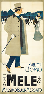
Franz Laskoff - E & A Mele & Co. / Abiti Per Uomo

Franz Laskoff was born in Poland and had worked briefly in Paris before coming to Milan. His style was strongly influenced by the Beggarstaff Brothers, who were known to reduce Art Nouveau to graphic essentials. Unlike many of his contemporaries, Laskoff understood the effectiveness of eliminating all excess details from his works. Although he only stayed in Italy until 1904, his avant-garde style had a major impact on many younger artists working there. 

Starting in 1896, the Neapolitan department store Mele became the biggest account for Ricordi, the pioneering Milan lithographer. Ricordi put its very best artist to work for the innovative retailer. Using large images, Mele brought the elegance and excitement of pre-war High Society to an eager and growing Italian bourgeois class. The posters were often reviewed in the press, and were also sold in fine art galleries.

Laskoff, one of Ricordi's greatest poster artists, produced five masterpieces for Mele between 1900 and 1904. His "Abiti per Uomo" is just one example of the remarkable caliber of his work. An elegant Neapolitan man walks in the Piazza Plebiscito, taking in the sights. It of course includes a young woman, who seems to stroll slowly enough for our protagonist to intercept her. There is no doubt that wearing his Mele Suit and topcoat he will be a great catch!

Tuesday, March 29, 2011

Michel Liebeaux – Peugeot

After World War II, Peugeot fell into financial hardship. To help boost sales, they developed the Quadrilette, a smaller, economically-designed car. It became the first of such types of automobiles to be made in the post-War period, making it exceptionally popular. Here, we see smoky examples of every type of man who should be behind the wheel of the new Quadrilette.

Monday, March 28, 2011

Otto Morach - Schweizer Werkbund Ausstellung

This extremely rare poster was created in 1918 by Otto Morach and is a brilliant avant garde graphic. MOMA’s last poster show, “Forever Ago”, featured this graphic in the exhibition.  This poster is one of my favorite and is also in my personal collection. There is very little information out there, which I could find, about the poster. If any of you have any more information about this poster, or know of any books that have this poster in it, I would love to hear from you.

Friday, March 25, 2011

Ernst Keller - Ausstellungen Walter Gropius


This is a “Walter Gropius, Rational Building Construction” poster by Ernst Keller for two exhibitions at the zurich Kunstgewerbemuseum in 1931.

In this poster, Ernst Keller, one of the greatest Swiss Poster designers of his time, uses the diagonal to attract the eye and to suggest dynamic activity. This was a common strategy by this time, but Ernst Keller’s poster is entirely original and genius in its control of space, masterly drawing and integrating the text.

“The printing of the image is by letterpress from linocut blocks overprinted from type in opaque grey.” The fingers gripping the handle of the trowel turn the hand into a fist, a universal symbol in political propaganda to suggest the acclamation and solidarity of a crowd.

Thursday, March 24, 2011

A.M. Cassandre - Nord Express

First introduced in 1896, the Nord Express traveled from Paris to Saint Petersburg, stopping in Brussels, Cologne, Hanover, Berlin, Konigsberg, and Daugavpils along the way. It was meant to connect with the Sud Express, also out of Paris, creating a direct link from Russia to Lisbon, where passengers could board ships to America. After World War I, the final stop changed from St. Petersburg to Warsaw, and then was shut down for good once World War II came around.
This poster shows how well Cassandre understood that with rail travel, you're selling the romance of far off horizons and the utter power of its speed. Although the viewer's eyes are focused on the rail, they are almost on the same level, focused on the seemingly distant, far off horizon. Using this angle of view, the dynamic power, speed, and huge size of the locomotive are expressed so beautifully.

Wednesday, March 23, 2011

Peter Birkhauser - PKZ

This stunning poster was the first one designed by Peter Birkhauser. This poster won first prize in the PKZ 1934 competition, beating his teacher, Niklaus Stoecklin's, famous poster of a gentleman in a bowler hat and overcoat.
Birkhauser's PKZ Button represents one of the greatest moments in the PKZ series and is one of my favorite Object Posters. Blown up to gigantic scale, Birkhauser's perfectly stitched button became an icon that in its beauty and precision comes to symbolize the quality for which the brand was famous.

Tuesday, March 22, 2011

G. Dola - The Sporting La Casquette of Sportsmen

"The Sporting" is the trendy golf hat of the former French sports caps manufacturer La Casque" in the 1930s. What's most impressive to me about this poster, besides for its rarity are the strong colors and stylish promotional design.

Monday, March 21, 2011

De Massa - 1930 Monza GP

This unbelievable 1930 Monza GP poster is one of my absolute favorite car posters and is extremely rare with around five known to exist. The artwork was done by De Massa. This race was held at the Circuit Milano on September 7, 1930. This race was an incredibly significant one for Maserati, who finished 1-2-3, with Achille Varzi winning in the 2.5 Liter Tipo 25M. Varzi was later nicknamed 'The Champion of Italy'.

Sunday, March 20, 2011

Privat Livemont - Absinthe Robette

Livemont started out as an interior designer in his home town of Schaerbeek, Belgium. He came to poster art after entering a poster contest on a whim and winning it. By 1898, The Poster magazine was calling him "the uncontested master of Belgian posterists." Though one of several posterists often assumed to be disciples of Mucha, Livemont's version of Art Nouveau was in fact well-developed before Mucha burst onto the scene in the 1890s.
In this poster, Absinthe, "The Green Fairy," is celebrated in this very famous Belgian poster. Made from wormwood, Absinthe was an addictive, ultimately poisonous, hallucinogen much beloved and maligned in the Belle Epoque. Wildly intoxicating at 144 proof, Absinthe was normally mixed with water that was filtered through a sugar cube which turned the clear liquor to an emerald green. Habitués, such as Toulouse-Lautrec often would progress toward drinking it almost straight.
This dreamy image by Livemont captures the essence of the absinthe subculture. The maiden appears in a mystical trance as she holds the glass aloft. The pale, emerald tones and patterns of the background are classics of Art Nouveau finery.
Often referred to as the "Belgian Mucha" for his idealized young beauties and rich organic settings, Livemont created more than forty posters before turning to painting early in the 20th century.

Friday, March 18, 2011

Adolphe Crespin - Paul Hankar Architect

Considered one of the best Belgian architects specializing in Art Nouveau, Paul Hankar often collaborated with Adolphe Crespin, who was a master of interior design. This poster is a perfect balance of their two styles. Paul Hankar was committed to reinterpreting time-honored traditions in his modern architecture and design. For example, the principal subject, positioned just right, is interpreted in a very modern style. There are many details in this poster that are chosen with such pleasure, and arranged with such taste and tact, that far from removing importance from the principal subject he lends it more value, creating a particular atmosphere. For example, Hankar’s chair and footstool with woven leather straps mix naturalistic rusticity and historical styles to create something new. The lantern, which came from Hankar’s townhouse in Brussels, is a similar combination. The wrought iron was manipulated to resemble plantlike tendrils extending from each corner; these natural forms were then paired with four flattened shapes evoking Flemish Renaissance strap work.  The warm and vivid coloring further adds to the merit of this print which remains, in my opinion, the best of Crespin.
Paul Hankar Architecte, by Crespin, is one of the posters from the turn-of-the-century "Masters of the Poster" series, which consists of 256 of the best posters of the Belle Epoque. And as you can see, it deserves to be there.

Thursday, March 17, 2011

Otto Baumberger: Baumann

The famous avant-garde hat-Poster by Otto Baumberger is a masterpiece of Swiss poster art. Baumberger, staged as one of the strictest Swiss poster designers, created his first Baumann poster in 1919 with “Bahnhoffstrasse 25” written on the bottom. With the huge success of the poster, the poster was reprinted in 1922 and 1928. This time, replacing “Bahnhoffstrasse 25” with “Fraumuensterstrasse 17”, due to the store’s change of address. The poster was again printed in 1952, however, the “B” which appeared in the top left hand corner in the earlier printings, was omitted in the later printing. This poster received so much praise that it has been showcased in exhibits around the world. The poster is featured in over 10 poster books including, “The Modern Poster”, “Master of Poster Art – Exhibition Poster Collection” and “History of the Poster”.